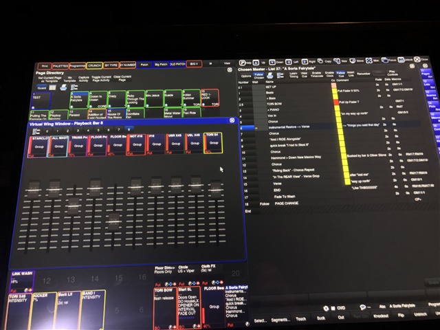
2 big issues with the Virtual Wing window on a RH4:
The window now takes up over 1/4 of the screen to display the same information it used to display in less space.
It needs a zoom of 200% to make the cuelist names legible…and a similar size to the playback toolbar.
The main issue is that the fader response is now stepped. Regardless of using the mouse or the touchscreen.
massive steps 80% > 84% > 95% > 100% making them unusable.
Happy to send a showfile if you can’t repro this.

